Alingsås Kulturhus



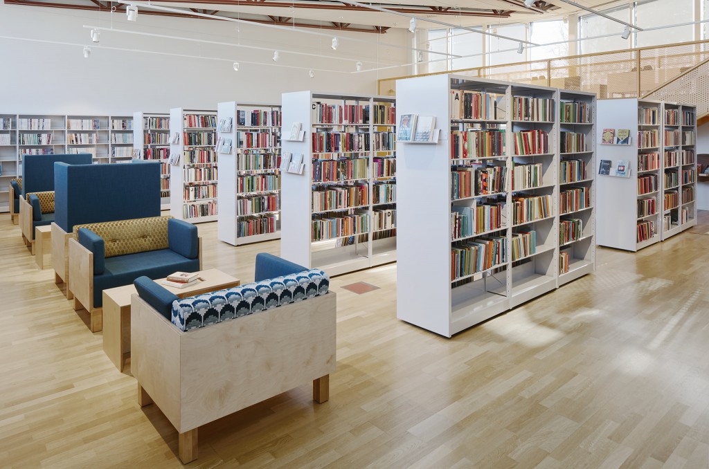
Alingsås Kulturhus has done away with the principle of the silent library and opened its doors to provide a relaxed, creative and cultural hub for everyone.
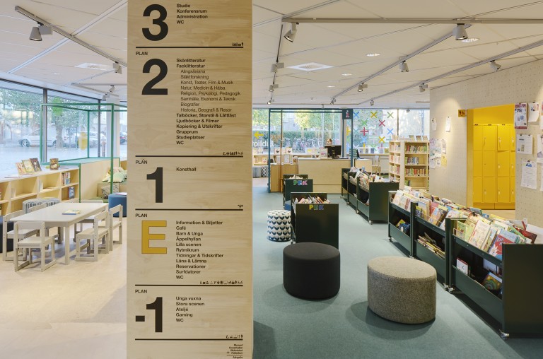
While the library has been the activity most often associated with Alingsås Kulturhus, the building has a great deal more to offer. In order to open things up and show visitors the breadth of culture on offer in-house, the interior has been extensively revamped with a focus on creativity and sustainability.
“It was essential to formulate a combined cultural centre where the various activities are publicised and can interact to show off the breadth of culture on offer here,” explains Jenny Andersson Höfvner, an architect with Bornstein & Lyckefors, which was responsible for configuration and planning of the re-development process and interior design.
An open-minded oasis
The new modern cultural centre is now made up of Alingsås museum, an art gallery and a city library, the Palladium performance venue, a youth zone, and accompanying office premises. In line with its values, the cultural centre represents an open-minded oasis with limitless scope. An exciting and creative space where everyone is welcome. But how to translate these values into spatial form and give them physical expression?
“The description of a broad-ranging venue for creativity, excitement and challenges turned our thoughts to a workshop. A robust location with tools for creating its own unique cultural experiences. Durable materials, creativity, change over time and activity are part and parcel of everyday life in workshops,” says Jenny.
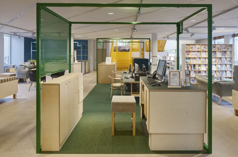
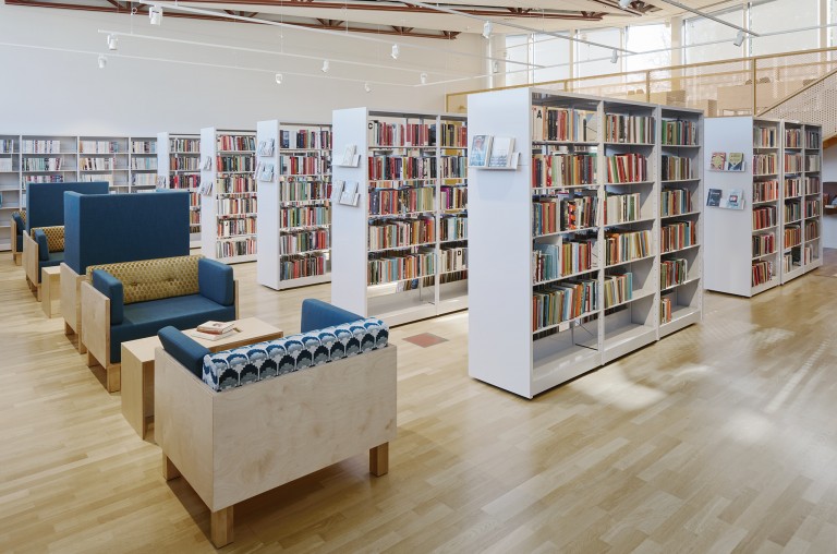
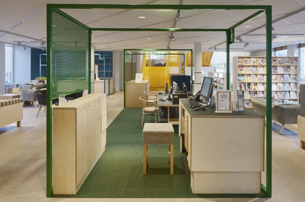
The workshop concept gave rise to materials with a robust feel such as plywood, screening walls of steel and a stone floor that will allow creative preparations. The screening walls were furnished with perforated holes, so information and notices could be hung up like tools in a carpenter’s tool shed.
Reuse provides character
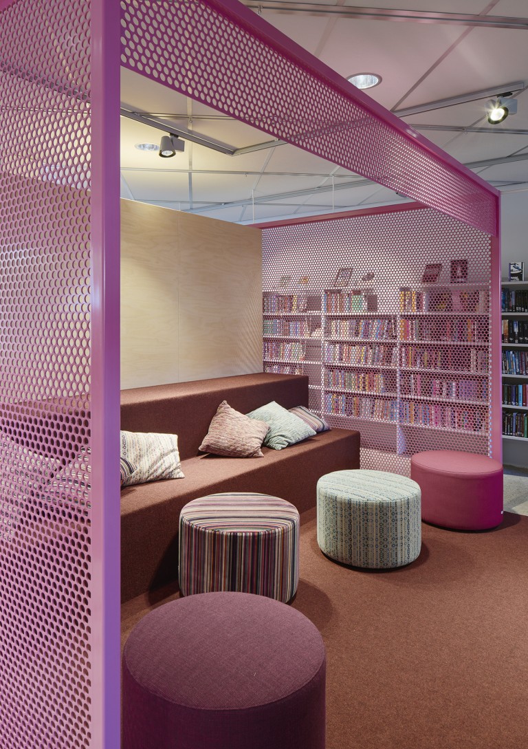
It was also important to provide contrasts and soften up the interior design of the workshop setting to create a welcoming environment. In order to retain the unpolished feel, ‘flea market’ and ‘grandma’s cushions’ were adopted as inspirational styling concepts. Armchairs, stools, tables, counters and similar fixtures have been specially designed to reflect this vision. In addition, just over 30 per cent of the existing furniture has been refurbished and reused. Efforts that lent character to the project and provided financial benefits for the client.
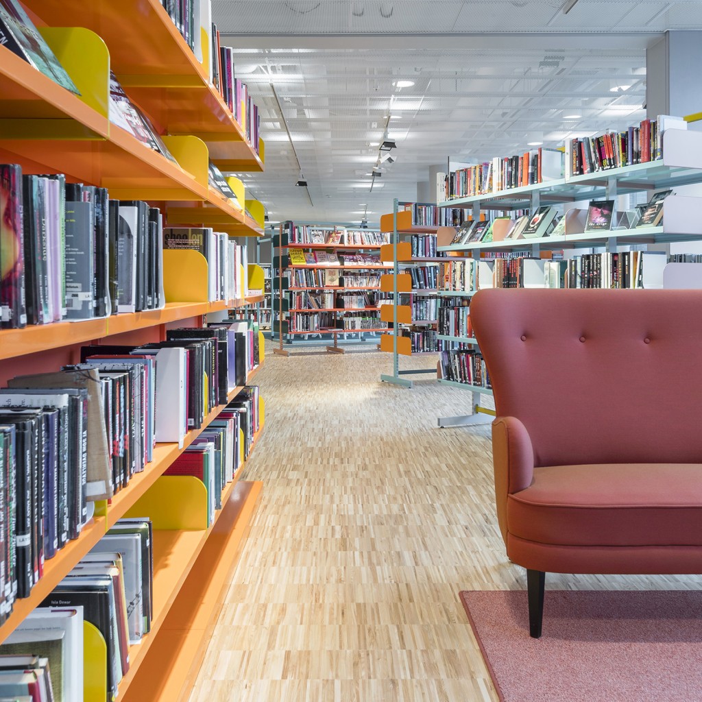
“There is no reason to discard fully functional furniture, as that is a drain on our shared natural resources and finances. As part of the project we completely refurbished the library system, among other elements. That was a logistics challenge, since we first had to dismantle the system, transport all components to local paintshops before then re-assembling it. Even the magazine shelves were reused, as were the table bases, which were given new table tops, while desktops and chairs were cleaned, polished and re-upholstered with new fabrics,” says Daniel Olofsson, Project Manager and Sales Representative at Input interior, which handled this reuse process and deliveries of new furniture.
Despite a mix of old and new, Alingsås Kulturhus has succeeded in creating an overall solution that works.
“At times when it is possible to reuse items without compromising on the overall standard, you should challenge yourself and go ahead. Reusing items added an eccentric element that ultimately made Alingsås Kulturhus more personal and cool with cheerful and bold patterned fabrics,” says Jenny.
Colours for communication
In order to create flows between the centre’s various activities, reorganisation was also required. The art gallery was relocated one floor down and spaces were made more efficient by introducing activity-based workplaces.
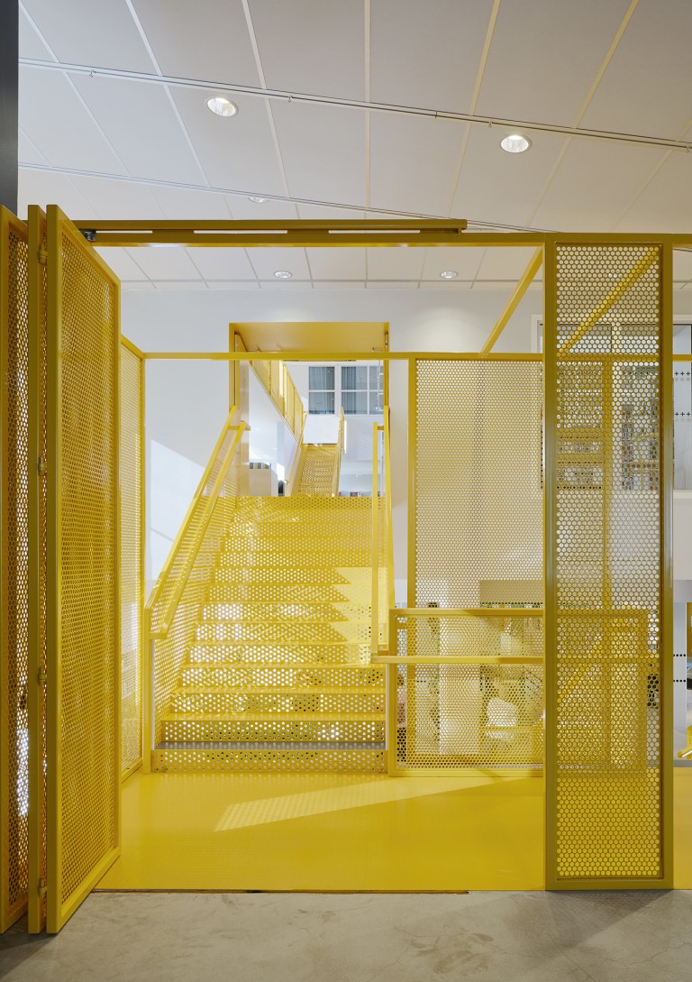
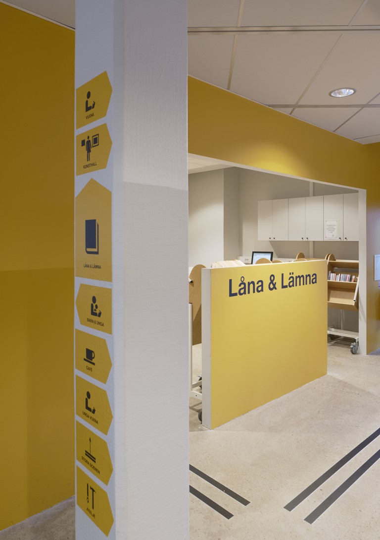
The layout and guiding of visitors in the physical environment has been reviewed and colours have been used as powerful communicators. The various activities at the cultural centre have been linked together by a vertical cross-section through the building, where facilities such as lifts, stairs and lending services are indicated by yellow. Other functions, such as information services and café amenities, are indicated by metal frameworks in a variety of colours, including green, pink and turquoise.
“All aspects of this project are worthy of praise in my book, but if I have to pick out specific details, I am particularly delighted with the perforated steel walls. They were really great,” concludes Jenny.
